3. SI 1 Correlation Analysis of Teres Major and Minor#
This Python script performs an analysis to determine the correlation between the log-transformed origin areas and volumes of specific shoulder muscles. The analysis is conducted for the following muscles:
Teres Major
Teres Minor
The log-transformation is applied to the origin areas and volumes to normalize the data and improve the accuracy of the correlation analysis.
3.1. Imports#
Required packages for this analysis can be found in the requirements.txt file. Ensure that all dependencies are installed before running the script.
Show code cell source
import pandas as pd
import seaborn as sns
import matplotlib.pyplot as plt
import scipy.stats as stats
import numpy as np
import os
import statsmodels.api as sm
from statsmodels.sandbox.regression.predstd import wls_prediction_std

# ANSI escape code for bold text in print
bold_start = "\033[1m"
bold_end = "\033[0m"
3.2. Input Setup#
Loads the Muscle_data.xlsx file containing all original data and log transforms origin area and experimental volume.
Show code cell source
# Construct the relative path to the data file
file_path = os.path.join('Muscle_data.xlsx')

# Load the data from the Excel file
data = pd.read_excel(file_path)

# Apply logarithmic transformation to the Origin_Area and Muscle_Volume_rec
data['Log_Origin_Area'] = np.log(data['Origin_Area (cm²)'])
data['Log_Volume_rec'] = np.log(data['Volume_rec (cm³)'])
data['Log_Volume_exp'] = np.log(data['Volume_exp (cm³)'])
3.3. Filter data#
Remove Supraspinatus, Infraspinatus and Subscapularis from the analysis to investigate them separately.
Show code cell source
# Filter data and store in values
filtered_dataTeres = data[~data['Muscle_Name'].isin(['Supraspinatus', 'Infraspinatus', 'Subscapularis'])]
# Step 2: Remove rows with missing values in the columns 'Origin_Area (cm²)' and 'Volume_exp (cm³)'
filtered_dataTeres = filtered_dataTeres.dropna(subset=['Origin_Area (cm²)', 'Volume_exp (cm³)'])

# store transformed variables
muscle_originTeres = filtered_dataTeres['Log_Origin_Area']
muscle_volumeTeres = filtered_dataTeres['Log_Volume_exp']
3.4. Tests for normality#
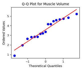
Performs a Shapiro-Wilk test and evaluates normality using Q-Q plots
Show code cell source
# Shapiro-Wilk test for normality
shapiro_test1Teres = stats.shapiro(muscle_originTeres)
shapiro_test2Teres = stats.shapiro(muscle_volumeTeres)

print("Shapiro-Wilk test for data1: ", shapiro_test1Teres)
print("Shapiro-Wilk test for data2: ", shapiro_test2Teres)

# Set figure size (convert cm to inches)
width_cm = 9
height_cm = width_cm * 0.75  # Aspect ratio of 4:3 (optional)
width_in = width_cm / 2.54
height_in = height_cm / 2.54

# Q-Q plot for data1
# Create figure with specified size
plt.figure(figsize=(width_in, height_in))
stats.probplot(muscle_originTeres, dist="norm", plot=plt)
plt.title("Q-Q Plot for Muscle Origin Area", fontsize=10)
plt.xlabel("Theoretical Quantiles", fontsize=9)  # Set xlabel font
plt.ylabel("Ordered Values", fontsize=9)  # Set ylabel font
# Apply custom font to tick labels
plt.xticks(fontsize=8)
plt.yticks(fontsize=8)
# Show Figure
plt.show()

# Q-Q plot for data2
plt.figure(figsize=(width_in, height_in))
stats.probplot(muscle_volumeTeres, dist="norm", plot=plt)
plt.title("Q-Q Plot for Muscle Volume", fontsize=10)
plt.xlabel("Theoretical Quantiles", fontsize=9)  # Set xlabel font
plt.ylabel("Ordered Values", fontsize=9)  # Set ylabel font
# Apply custom font to tick labels
plt.xticks(fontsize=8)
plt.yticks(fontsize=8)

plt.show()
Shapiro-Wilk test for data1:  ShapiroResult(statistic=0.9764683665986374, pvalue=0.9183015896483309)
Shapiro-Wilk test for data2:  ShapiroResult(statistic=0.9379240782979819, pvalue=0.2943891441958709)

3.5. Pearson Correlation Analysis#
Show code cell source
# Correlation analysis for Teres major and minor

r, p = stats.pearsonr(muscle_originTeres, muscle_volumeTeres)
# Calculate degrees of freedom
n = len(muscle_originTeres)
df = n - 2


# Calculate confidence interval for Pearson correlation coefficient
alpha = 0.05  # significance level for 95% confidence interval
z = np.arctanh(r)
SE_z = 1 / np.sqrt(n - 3)
z_critical = stats.norm.ppf(1 - alpha / 2)
z_lower = z - z_critical * SE_z
z_upper = z + z_critical * SE_z
r_lower = np.tanh(z_lower)
r_upper = np.tanh(z_upper)

# Create p_tex value
if p < 0.001:
    p_tex = "<0.001"
elif p < 0.05:
    p_tex = "<0.05"
else:
    p_tex = ">0.05"


# Calculate the linear regression
x = filtered_dataTeres['Log_Origin_Area']
y = filtered_dataTeres['Log_Volume_exp']
X = sm.add_constant(x) # add column for intercept
re = sm.OLS(y, X).fit()
# print the summary of the linear regression
print(re.summary())
                            OLS Regression Results
==============================================================================
Dep. Variable:         Log_Volume_exp   R-squared:                       0.431
Model:                            OLS   Adj. R-squared:                  0.393
Method:                 Least Squares   F-statistic:                     11.36
Date:                Wed, 06 Nov 2024   Prob (F-statistic):            0.00421
Time:                        16:29:23   Log-Likelihood:                -21.520
No. Observations:                  17   AIC:                             47.04
Df Residuals:                      15   BIC:                             48.71
Df Model:                           1
Covariance Type:            nonrobust
===================================================================================
                      coef    std err          t      P>|t|      [0.025      0.975]
-----------------------------------------------------------------------------------
const               1.9960      0.516      3.872      0.002       0.897       3.095
Log_Origin_Area     1.0780      0.320      3.370      0.004       0.396       1.760
==============================================================================
Omnibus:                        0.199   Durbin-Watson:                   1.944
Prob(Omnibus):                  0.905   Jarque-Bera (JB):                0.399
Skew:                           0.070   Prob(JB):                        0.819
Kurtosis:                       2.263   Cond. No.                         4.99
==============================================================================

Notes:
[1] Standard Errors assume that the covariance matrix of the errors is correctly specified.
C:\ProgramData\anaconda3\envs\env_MuscVolReco\Lib\site-packages\scipy\stats\_axis_nan_policy.py:531: UserWarning: kurtosistest only valid for n>=20 ... continuing anyway, n=17
  res = hypotest_fun_out(*samples, **kwds)
Show code cell source
# determine results
# determine prediction intervals boundaries
prstd, iv_l, iv_u = wls_prediction_std(re)
# determine slope and intercept
intercept = re.params.iloc[0] # The first parameter is the intercept
slope = re.params.iloc[1]      # The remaining parameters are the slope(s)

# determine y values for linear model
y_pred = slope * x + intercept

# Format the regression line equation
if intercept < 0:
    regression_eq = f'y = {slope:.2f}x - {abs(intercept):.2f}'
else:
    regression_eq = f'y = {slope:.2f}x + {intercept:.2f}'

# Reporting
print(f"\nThe Pearson correlation coefficient was found to be {bold_start}r = {r:.2f}{bold_end}, p = {p:.2e}, \nwith degrees of freedom df = {df} (n = {n}).\n")

print(f"95% Confidence interval for r: ({r_lower:.2f}, {r_upper:.2f})\n")
print(f"The Regression line equation is: {bold_start}{regression_eq}{bold_end}.\n")


# Figure settings Correlation Teres

# Define the custom colors for each muscle
custom_colors = {
    'Teres Minor': (0.741, 0.8, 0.384),
    'Teres Major': (0.871, 0.435, 0.427)
}

# Define unique markers for specimen
custom_markers = {
    'Hylobates': 'P',
    'Symphalangus': 'X',
    'Pongo': 'D',
    'Gorilla': '^',
    'Pan': 'v',
    'Homo': 's'
}

# Get unique muscle names and specimen names
muscle_names = filtered_dataTeres['Muscle_Name']
specimen_names = filtered_dataTeres['Genus']

# Set figure size (convert cm to inches)
width_cm = 8.5
height_cm = 11
width_in = width_cm / 2.54
height_in = height_cm / 2.54

# Create the figure and subplots
fig, ax1 = plt.subplots(nrows=1, ncols=1, figsize=(width_in, height_in))

# sort values before using the fill_between function
# Sort the values based on x (Log_Origin_Area)
sorted_indices = x.argsort()
x_sorted = x.iloc[sorted_indices]
iv_l_sorted = iv_l.iloc[sorted_indices]
iv_u_sorted = iv_u.iloc[sorted_indices]

# Plot the prediction intervals as shaded areas
ax1.fill_between(x_sorted, iv_l_sorted, iv_u_sorted, alpha=0.1, color='red', linewidth = 0) # 95% Prediction Interval

# Determine line for isometric scaling
Y = filtered_dataTeres['Log_Origin_Area'] + slope*min(filtered_dataTeres['Log_Origin_Area']) + intercept -min(filtered_dataTeres['Log_Origin_Area'])
ax1.plot(filtered_dataTeres['Log_Origin_Area'], Y, color='grey')

# Plot each data point with the respective color and marker
for muscle, color in custom_colors.items():
    for specimen, marker in custom_markers.items():
        mask = (muscle_names == muscle) & (specimen_names == specimen)
        sns.scatterplot(x='Log_Origin_Area', y='Log_Volume_exp', data=filtered_dataTeres[mask], ax=ax1,
                        color=color, marker=marker)

# Plot regression line
sns.lineplot(x=x, y=y_pred, color='red', ax=ax1)

# Apply custom fonts to the plot
ax1.set_title('Teres Major and Minor', fontsize=10)
ax1.set_xlabel('Log Muscle Origin Area (cm$^2$)', fontsize=9)
ax1.set_ylabel('Log Muscle Volume (cm$^3$)', fontsize=9)

ax1.tick_params(axis='both', which='major', labelsize=8)
for label in ax1.get_xticklabels() :
    label.set_size(8)

ax1.annotate(
    f'Regression line: {regression_eq}\nPearson r: {r:.2f}\n95% CI: ({r_lower:.2f}, {r_upper:.2f})\np-value: {p_tex}',
    xy=(0.05, 0.95), xycoords='axes fraction', fontsize=9,
    horizontalalignment='left', verticalalignment='top'
)


# Create custom legend handles
handles_muscles = [plt.Line2D([0], [0], marker='o', color='w', label=muscle,
                              markerfacecolor=color, markersize=10)
                   for muscle, color in custom_colors.items()]

# Create handles with italicized labels
handles_specimen = [
    plt.Line2D(
        [0], [0],
        marker=marker,
        color='w',
        label=f'${specimen}$',  # Italicize the label here
        markerfacecolor='gray',
        markersize=10
    )
    for specimen, marker in custom_markers.items()
]

# Add legends above and below the plots
fig.legend(handles=handles_specimen, title='Genus', loc='upper center', ncol=3)
fig.legend(handles=handles_muscles, title='Muscles', loc='lower center', ncol=6)

# Adjust layout to make room for legends
plt.tight_layout(rect=[0, 0.1, 1, 0.8])  # Leave space for legends

plt.show()
The Pearson correlation coefficient was found to be r = 0.66, p = 4.21e-03,
with degrees of freedom df = 15 (n = 17).

95% Confidence interval for r: (0.26, 0.86)

The Regression line equation is: y = 1.08x + 2.00.

Fig. 3.1 SI Figure 1: Pearson correlation of logarithmic transformed origin area and volume of teres major and minor muscles. The red line represents the best-fit linear regression line between muscle origin area and volume. The red shaded area around the red line indicates the prediction intervals.The grey line represents the prediction assuming isometric scaling with a slope of one.#